✦ Problem
✦ Solution
Team - 3 other UXD designers
Duration - 4 Months
Tools - Figma, Miro, Slack
✦ Solution
Placing the obvious front and centre
✦ Project Roadmap
We started with content audit to understand lay of the land. This was followed by usability testing of the existing website and several design solutions and iteration to address the core issue.

✦ Findability Study
Findability Test - Are you able to book an appointment?
Two pro UX designers tackled a single goal: book an appointment. Confusing terminology and maze-like navigation hindered users, requiring a clearer approach.
✦ Primary Research
Why did the users fail?
Four patients and two therapists were interviewed to ensure unbiased data collection.
Patients says - "Where the button to book appoinmtment? It is too confusing for me."
Other therapist says - "It's difficult to differentiate between what is for patients and what is meant for other therapists"
✦ Contextual inquiry
Such a bad website for such a beautiful studio! The ambience of website and the actual studio was worlds' apart.


✦ The 5 Why method
From the surface to the root cause of why was the user unable to book an appointment?
✦ Storyboard persona
Why because you will understand Soulful Sarah Better if you look at her story. Stories will help UXD's emphatize better with personas.


✦ Content Audit
We audited the existing information architecture and make a complex excel sheet to understand how users make way finding decisions.
✦ User Journey Map
Soulful Sarah goes through a lot of emotions, decisions, ups and downs, all while simply trying to book an appointment.
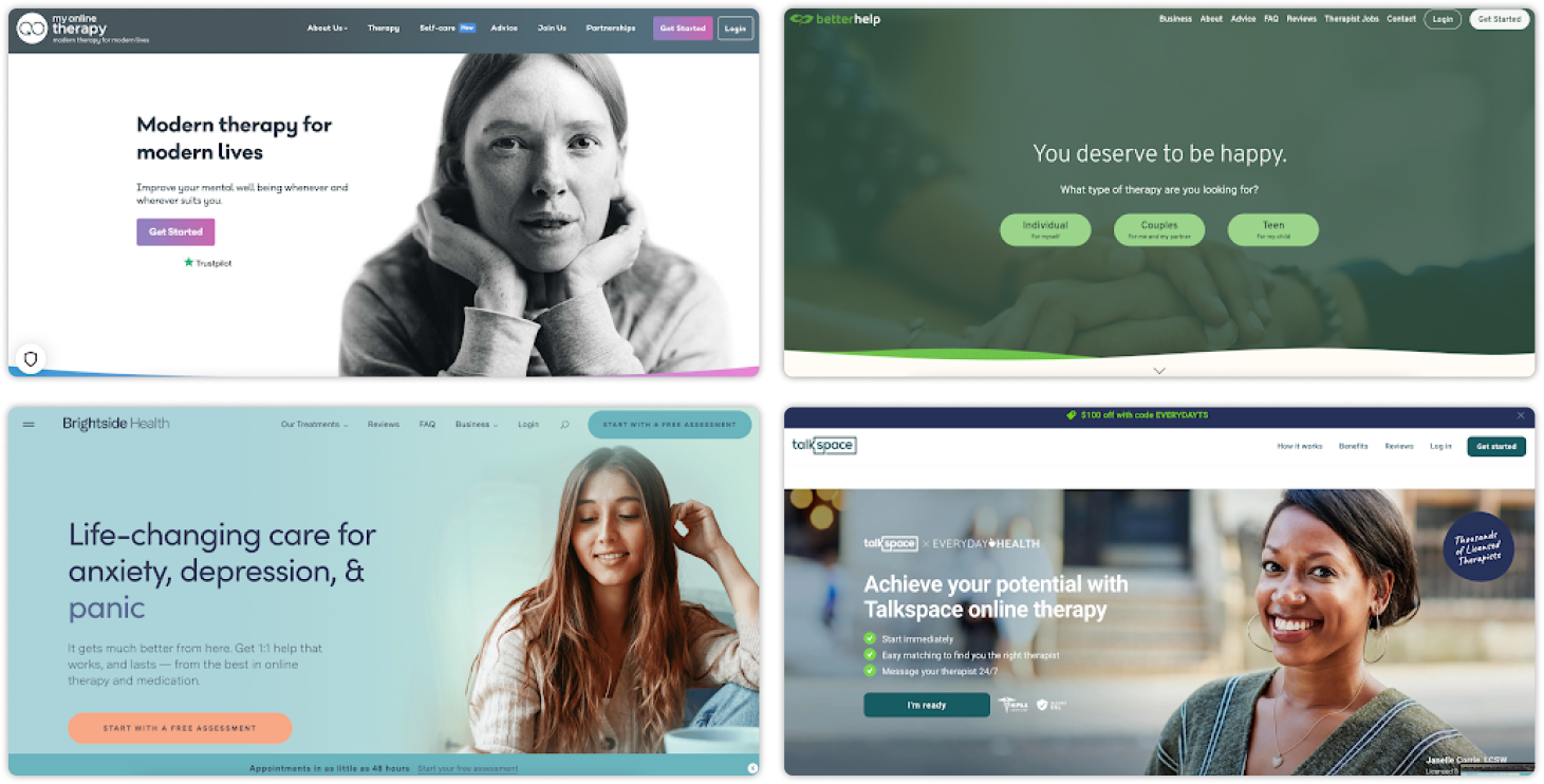
✦ Competitive Analysis
How does 10 competitor manage appointment booking?
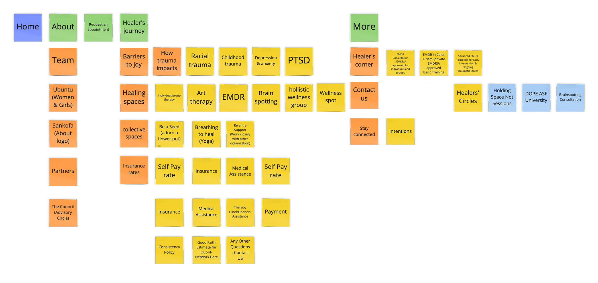
✦ Current Information Architecture
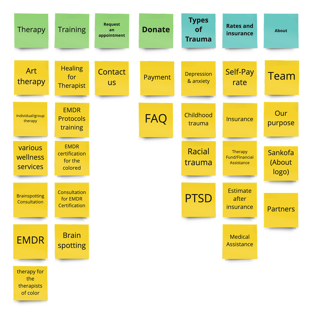
✦ Proposed Information Architecture
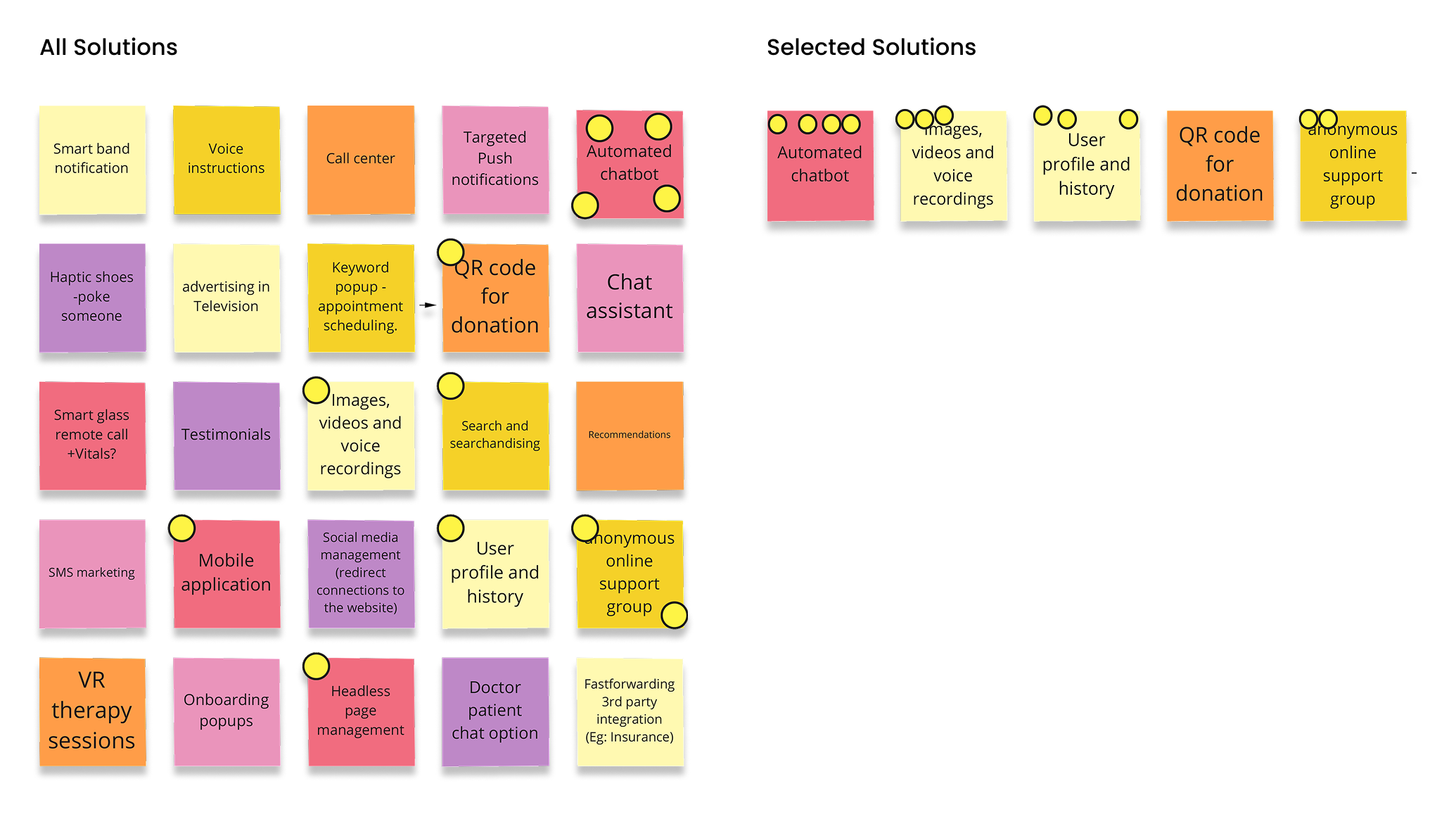
✦ Ideation for new features
Card Sorting, brain storming and dot voting
✦ Early Sketches
Hand-drawn paper prototype : Test, change and test again

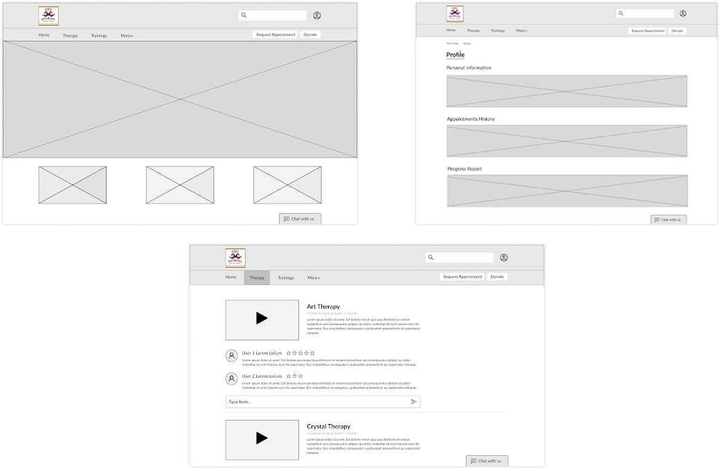
✦ Digital Wireframes
✦ Style Guide
A simple design standard all across all screens

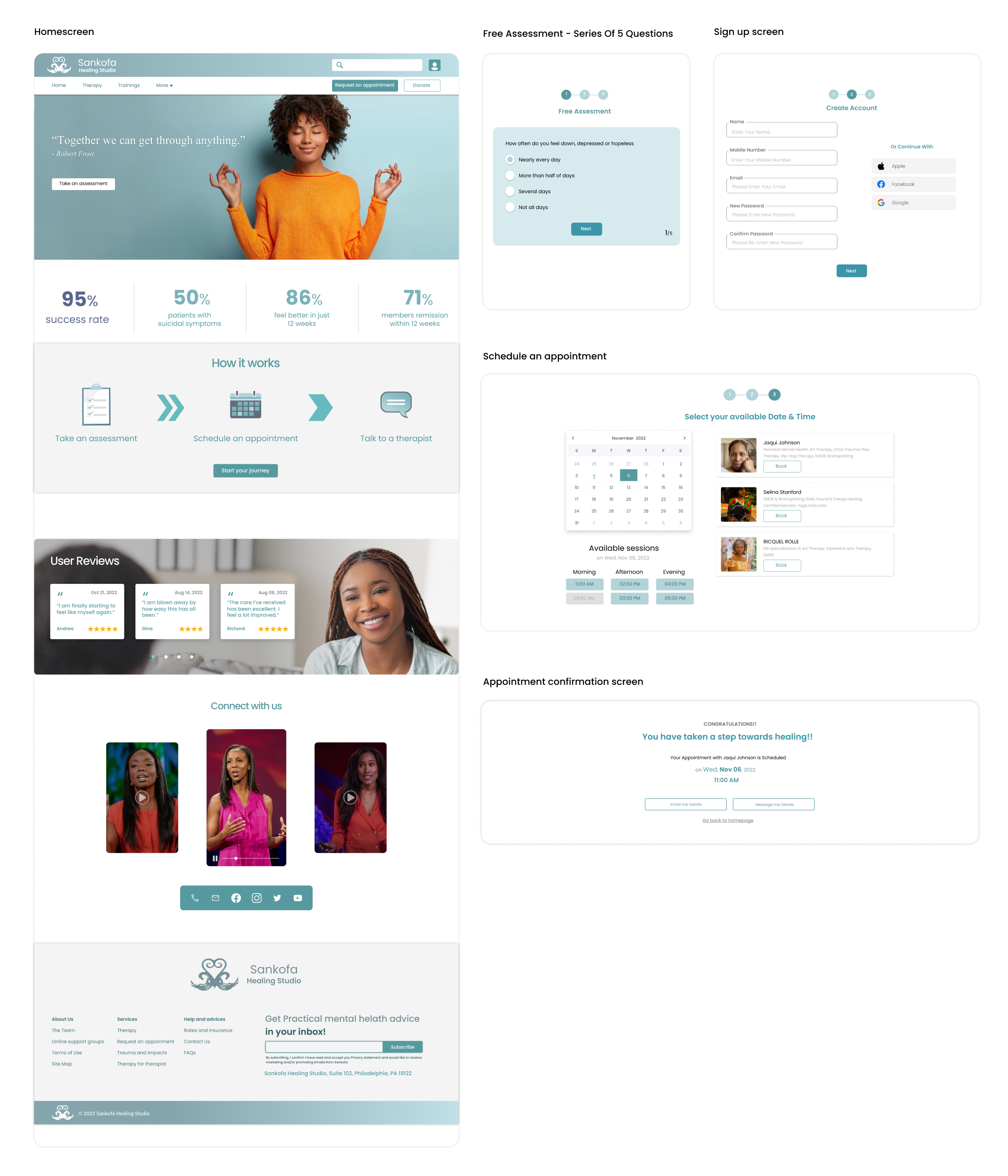
✦ High-fidelity wireframes
✦ Usability testing
10 students participated in the moderated usability testing


✦ Learnings
Next up ...
Built with lots of caffeine, love, and Webflow
Ebin Jose © 2025
